
Sound & music simplified
Teenage Engineering
Web design
UI/UX
Identified key navigation issues and user pain points on a music tech website to help improve usability and ensure it hits the right notes for new customers.
-
I redesigned the Teenage Engineering website to help it hit the right notes for new users. While the brand creates beautifully crafted user friendly instruments and tech, the website felt out of tune, confusing and hard to navigate. My redesign fine tunes the user journey making the experience as seamless and creative as the products themselves.
-
I led a self-initiated UX redesign of the Teenage Engineering website, focusing on improving the experience for new users. Through user research and analysis, I identified key pain points that made navigation confusing and the site difficult to use. Based on these insights, I redesigned the site’s structure and navigation to create a clearer, more intuitive user journey that better reflects the brand’s creative and user-friendly ethos.
-
The redesign resulted in a streamlined and more intuitive website structure that significantly improves the user experience for first-time visitors. By simplifying navigation and clarifying product discovery, the new concept aligns the website more closely with Teenage Engineering’s innovative and user-friendly brand. This refreshed approach helps users engage with the products more easily, reducing frustration and encouraging exploration.
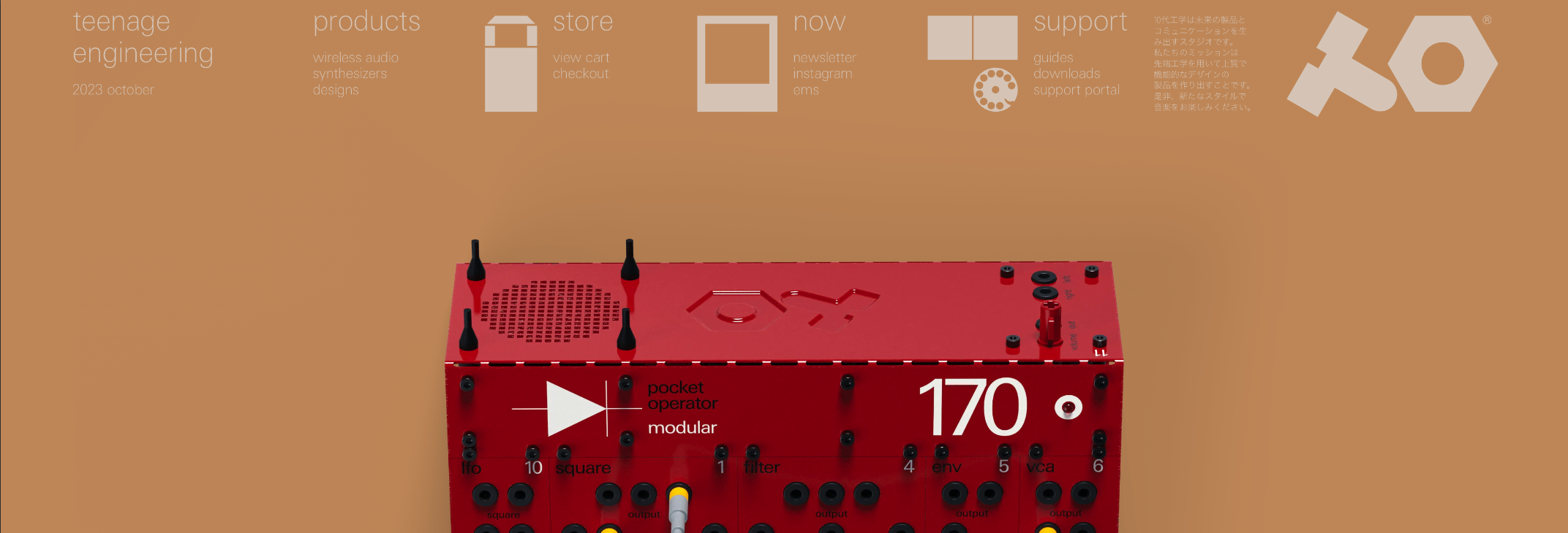
The current navigation relies heavily on large icons paired with simple listings, which, while visually distinctive, make exploring other pages challenging. Additionally, there is inconsistency in both functionality and visual design across different screen sizes.
The mobile version, in particular, feels like a design compromise due to the navigation format and would benefit from further refinement to improve usability and cohesion.

To improve the user experience, I simplified the website navigation by introducing a sticky navigation bar and a full-width dropdown menu, along with new product iconography to better categorise items. These changes help ensure the navigation functions consistently across different screen sizes, including mobile devices.

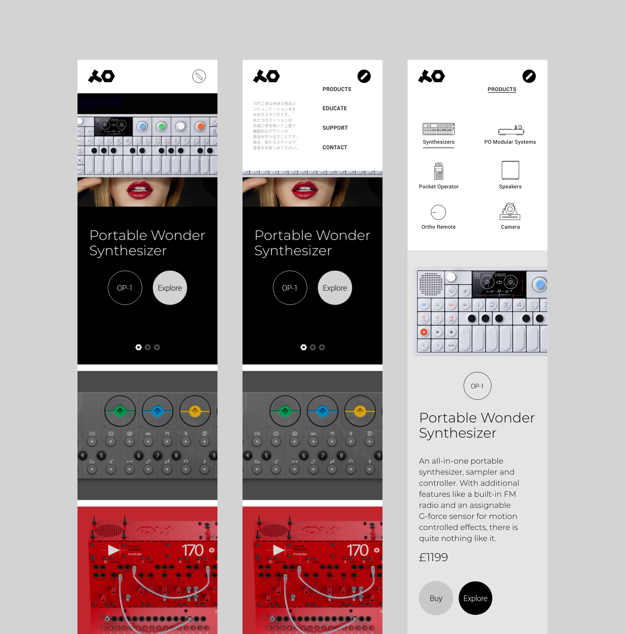
The landing page structure was redesigned with a portfolio-style grid to better showcase product imagery, featuring hover overlays that reveal item codes for added context. I also updated the existing UI design system to align with the new navigation and site structure, using their distinctive brand colours to prioritise functionality while preserving visual appeal.


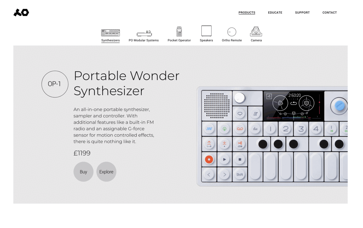
The current site separates product details and purchasing into different pages, causing unnecessary navigation. For example, users must view a product, then navigate again to see pricing and purchase options.


I simplified this by combining both into a single page, showing the product, price, and a clear call-to-action to explore further.

With the added ‘Explore’ button placed alongside ‘Buy’ on the same page, users can now access detailed product information with a single click. An accordion-style motion reveals the details directly beneath, while a close button at the end of the section allows users to collapse the view and continue browsing other products in the same category.


