
User navigation that misses a beat
[Teenage Engineering]
An audit of navigation challenges and user pain points across the product pages to create a more seamless and user-friendly experience for new customers.
-
Conceptual revamp of the Teenage Engineering website designed to better connect with new users. While the brand creates beautifully crafted, user-friendly instruments and tech, the website felt confusing and difficult to navigate. My redesign fine-tunes the user journey, creating an experience that feels as seamless and creative as the products themselves.
-
This website audit project focused on simplifying the digital experience through an updated UI design system, while preserving Teenage Engineering’s playful and experimental identity to create a more intuitive and accessible journey for both new and existing users.
-
By simplifying navigation and product discovery, the concept better aligns with Teenage Engineering’s innovative, user-friendly brand while encouraging easier exploration and engagement.

The current navigation relies heavily on large icons and minimal listings, which, while visually distinctive, make exploring the site difficult. There is also inconsistency in both functionality and visual design across different screen sizes.
The mobile experience, in particular, feels compromised by the navigation structure and would benefit from further refinement to improve usability and overall cohesion.
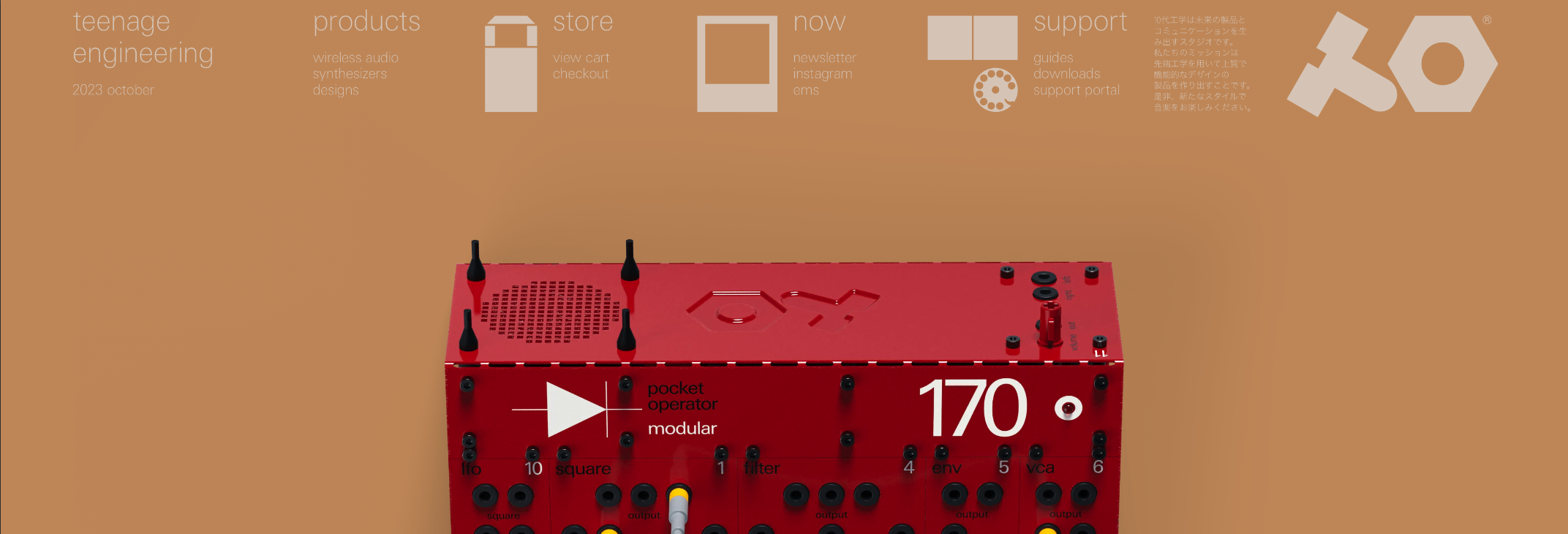

To support the UX improvements, the brand’s UI was refined with rounded call-to-actions, clear product coding, and subtle nut-and-bolt iconography inspired by the geometric design of the products. These updates improve hierarchy, visibility, and functionality across the website’s design system.

The website navigation was simplified through the introduction of a sticky navigation bar, a full-width dropdown menu, and new product iconography to better categorise items. These changes follow UX best practices, creating a more consistent and intuitive navigation experience across all screen sizes, including mobile devices.
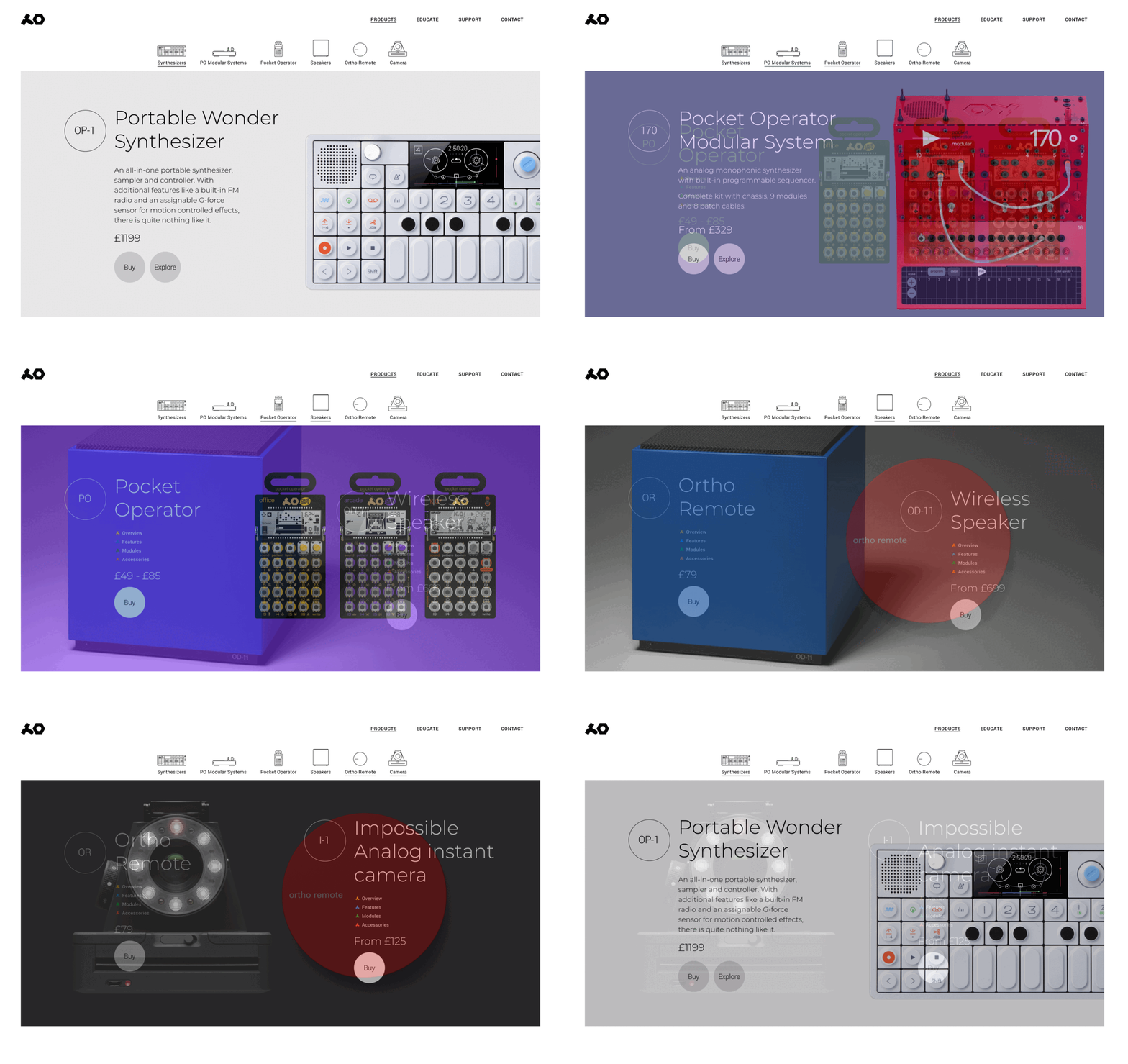

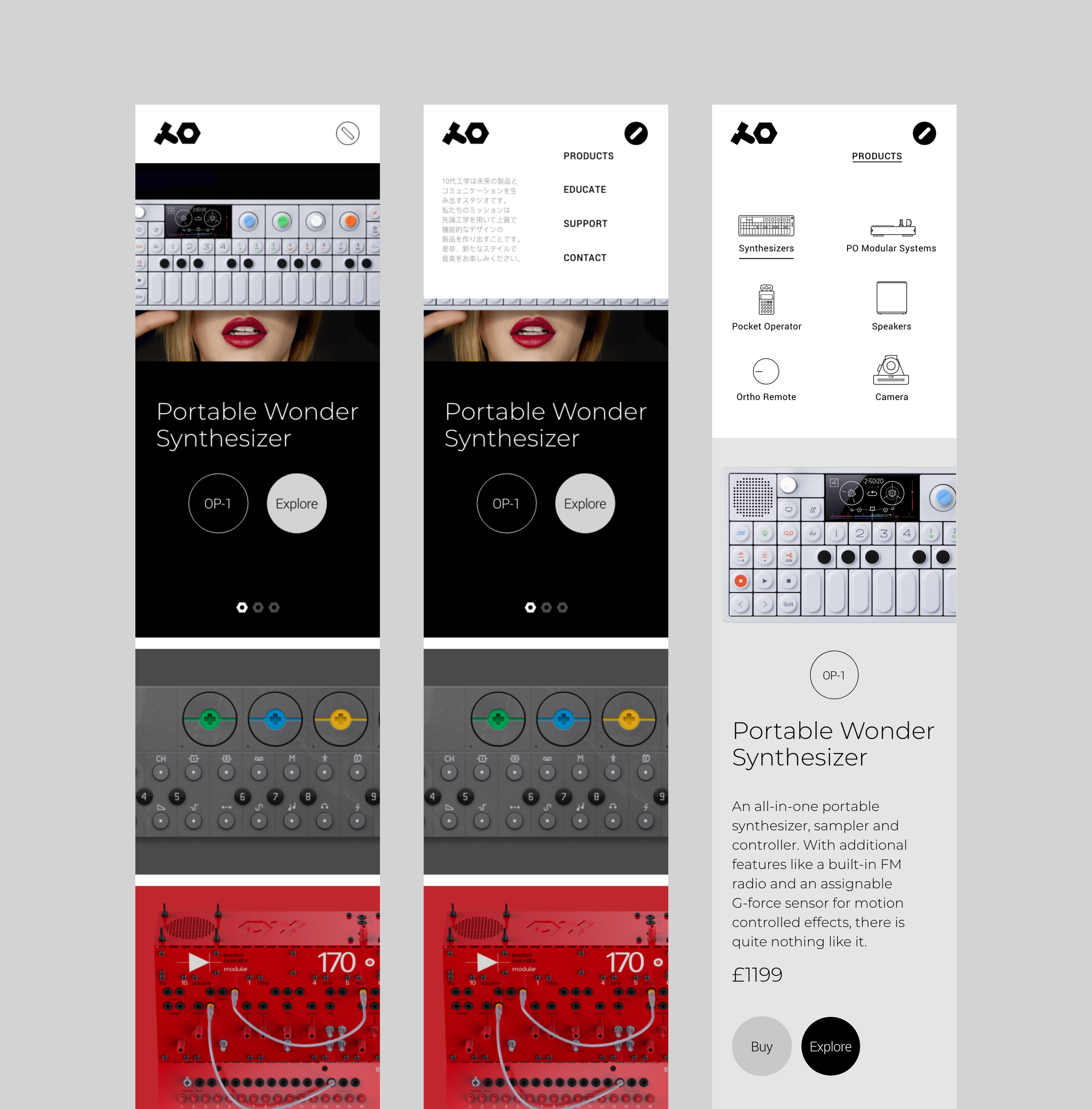

The landing page was redesigned using a portfolio-style grid to better showcase product imagery, with hover overlays revealing item codes for added context. The existing UI design system was also refined to align with the new navigation and site structure, using Teenage Engineering’s distinctive brand colours to balance functionality with visual appeal.

The current site separates product details and purchasing into different pages, creating unnecessary and hidden navigation. For example, users must first view a product page and then navigate again to access pricing and purchase options.
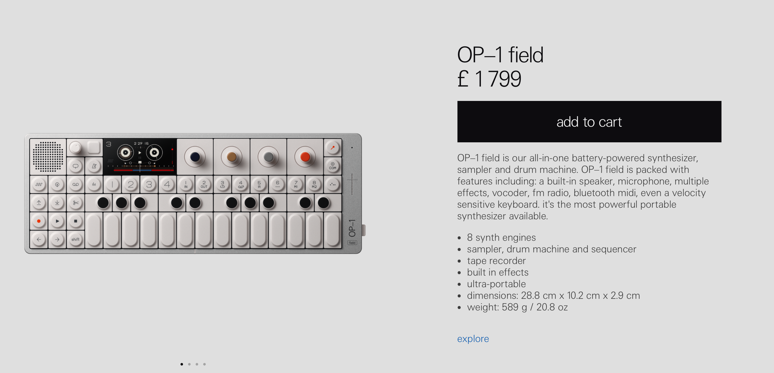

This was simplified by combining both buttons into a single landing page, allowing users to view the product, pricing, and a clear call-to-action in one seamless experience.

With the addition of an ‘Explore’ button alongside ‘Buy’ on the same page, users can access detailed product information with a single click. An accordion-style interaction reveals the details directly beneath the product, while a close button allows users to collapse the section and continue browsing within the same category.

[what others say]
[contact]